


Numbers are great for number crunchers, but sometimes your data is easier to understand in a visual format. But with all the types of charts available in Excel, how do you choose the right chart type for your specific data? Fortunately, you don’t have to play a guessing game; certain types of data lend themselves best to specific types of charts.
Comparing Two or More Items
When you’re comparing two or more items or values at a fixed point in time, your best choice is a bar chart. In a bar chart, each data point is represented by a horizontal bar going from left to right. Each person or thing represented has its own unique bar on the Y (vertical) axis; values for each bar run along the X (horizontal) axis.
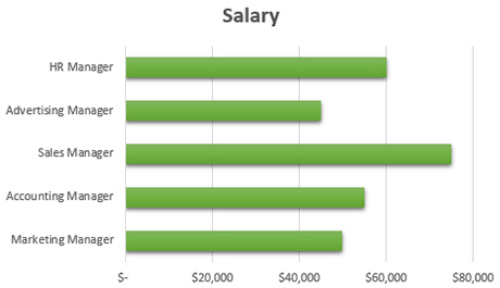
For example, let’s say you’re comparing the salaries of different positions in your company. Create a bar chart with each position having its own data series or bar. The higher the salary, the longer the bar along the X axis.
Expressing Data Over Time
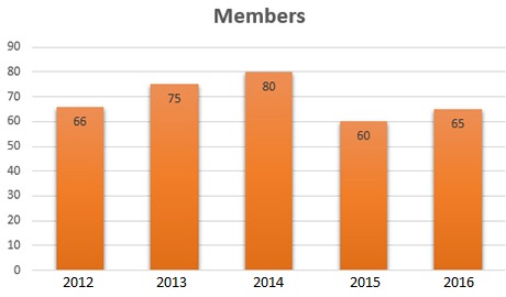
If on the other hand, you’re comparing the values of one or more items over multiple time periods, you should represent your data as a column chart. In a column chart, each data point is represented by a vertical column going from top to bottom. Each item represented has its own unique column on the X (horizontal) axis; values of each column run along the Y (vertical) axis.
For example, if you’re showing the number of members in an organization over a five-year period, create a column chart with the numbers for each year represented as distinct columns, running from left to right. This way you can easily see the data values for each year examined.
By the way, you can easily compare the same data from multiple sources over time by using a 3-D column chart. That is, you might break out members by age group, and then show those numbers for each of the five years examined. You essentially create multiple columns for each year period along the Y axis.
Highlighting Trends Over Time
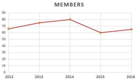
If your intent is to focus on discrete values in each time period examined, a column chart works best. If on the other hand, you want to draw attention to the data trends over a given time period, you should create a line chart. Yes, each point on the line represents a distinct value for a given time period, but the viewer’s eye focuses on the line itself instead of the individual data points.
Typically, time periods are displayed on the X (horizontal) axis, with values along the Y (vertical) axis. You can use multiple lines to compare different items or categories over the same time period.
Take our previous example of an organization’s membership numbers for five consecutive years. Express this data as a line chart and you immediately see the upward or downward trends in membership.
Expressing the Magnitude of Change
Line charts are great for showing change, but if you want to emphasize the magnitude of change, use the related area chart. An area chart is similar to a line chart, but with the area beneath the line filled in. Typically, time periods are displayed on the X (horizontal) axis, with values along the Y (vertical) axis.
For example, let’s say you’re tracking sales levels for a new product over a five-year period, and sales are good. Express those values in an area chart and viewers immediately sense the weight of the sales data.
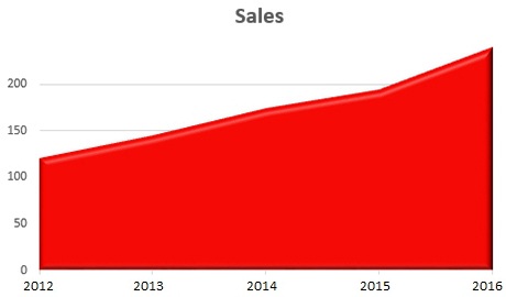
Now, this assumes that there is a magnitude of change in your data over time. If you have a measly 1% growth rate, it’s going to make for a very flat, boring area chart. Area charts are most impressive when change appears as a distinct upward diagonal line. (Or, for that matter, a downward diagonal if you have bad news.) If data values are relatively constant across the tracked time periods, use a column chart instead.
You can use a stacked area chart to express cumulated totals over time. That is, if you’re tracking sales levels for multiple products in a portfolio over a five-year period, stack one product’s sales on top of the others so that the top-most value is your total sales number. Each “stack” on the chart represents sales of an individual product.
Comparing the Components of a Whole
If you want to show the values of individual components proportional to a whole—typically as a percentage of the whole—then a pie chart is the way to go. Each component becomes an individual slice of the pie, and it’s easy to grasp the relative size of each component by visually comparing the sizes of each slice.
For example, let’s say you’ve polled the members of an organization as to their political leaning. A pie chart lets you show the percentage of members who hold a given political position, as a percentage of the total membership.
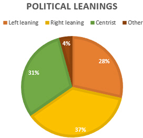
The only drawback to a pie chart is that it only compares components over a single time period. When you need to examine component data over time, use a stacked area chart instead.
Tracking Stock Performance
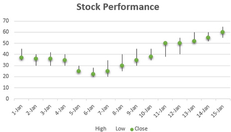
If you want to track the performance of stocks and other investments, use a stock chart. This type of chart represents each day’s performance as a vertical line, with points on the line representing opening price, closing price, high price, low price, and the like. When plotting stock performance over time, create different vertical lines for each day or time period tracked.
Presenting Two Different Types of Data
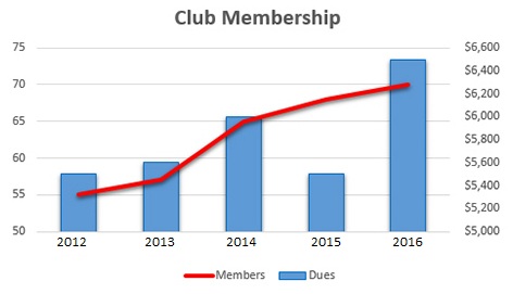
What do you do if you need to express two disparate types of data on the same chart? For example, you may want to show the number of members over time, along with the total value of membership dues collected over the same time period. How do you express both members and dollars on the same chart?
The solution is to create what Excel calls a combo chart. This type of chart actually combines two different chart types on a single chart. You get two different Y axes, one on the left and one on the right, for the different types of data.
Using our members-and-dues example, the combo chart might combine a line chart tracking number of members over time with a column chart tracking dues collected over the same time period. The axis for the line chart is in units, while the axis of the column chart is in dollars. Obviously, the X axis (years) is the same for both data sets.
Now that you’ve learned about the various Excel chart types, you can choose the right chart for your data.


")

